skip to main
|
skip to sidebar
roggr
A blog about technology, Web startups, and other things.
2011-04-27
The art of choosing fonts
Wells Fargo emails use a pretty wild array of
fonts
.
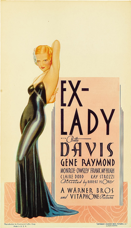
Reminds me of those vintage mixed-font posters (
source
).
No comments:
Post a Comment
Newer Post
Older Post
Home
Subscribe to:
Post Comments (Atom)
Blog Archive
►
2021
(2)
►
March
(1)
►
February
(1)
►
2018
(2)
►
December
(2)
►
2017
(1)
►
January
(1)
►
2016
(8)
►
December
(3)
►
November
(2)
►
September
(1)
►
April
(1)
►
January
(1)
►
2015
(2)
►
March
(1)
►
February
(1)
►
2014
(6)
►
June
(2)
►
May
(1)
►
April
(2)
►
March
(1)
►
2013
(12)
►
August
(1)
►
July
(1)
►
June
(2)
►
May
(1)
►
April
(4)
►
March
(1)
►
January
(2)
►
2012
(9)
►
September
(2)
►
August
(1)
►
July
(1)
►
May
(3)
►
March
(1)
►
February
(1)
▼
2011
(12)
►
October
(1)
►
September
(2)
►
August
(2)
►
July
(2)
▼
April
(3)
The art of choosing fonts
This is why Apple wins on mobile devices
Ted Dziuba is my homeboy
►
March
(1)
►
February
(1)
►
2010
(13)
►
November
(5)
►
October
(1)
►
August
(1)
►
July
(1)
►
March
(1)
►
February
(2)
►
January
(2)
►
2008
(3)
►
April
(3)
►
2006
(1)
►
November
(1)
Pages
About Me

No comments:
Post a Comment